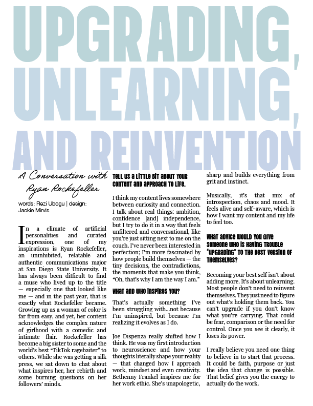
For this print spread created for University Girl, I designed an editorial layout that reflects themes of growth, reflection, and self-reinvention. The magazine emphasizes bold, out-of-the-box design and encourages pushing creative boundaries, which directly influenced my approach to this piece. I wanted the layout to feel both expressive and engaging while still supporting the tone of the article.
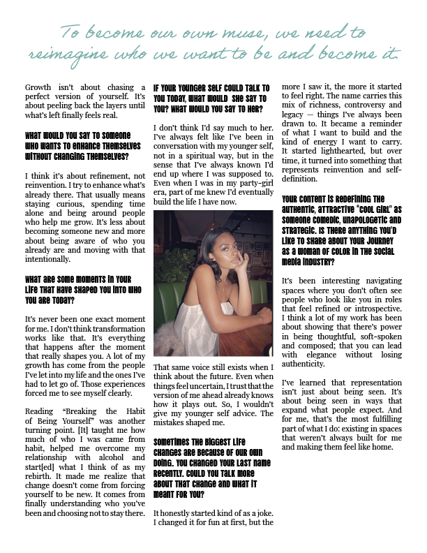
The oversized headline establishes a strong and confident entry point, while softer typographic elements help balance the intensity of the message and create a more personal feel. I focused on building a layout that allows the reader to move naturally through the content, guiding them between longer interview sections and more intimate moments. Careful attention to hierarchy, spacing, and scale helped organize the text while maintaining visual interest across the spread.
Throughout the process, I received multiple rounds of feedback from the head designers, which was extremely valuable in refining both the layout and typographic decisions. This collaborative process helped me strengthen my ability to iterate and improve a design based on critique.
This piece reflects my approach to editorial design, focusing on creating layouts that are both visually engaging and supportive of the narrative.