
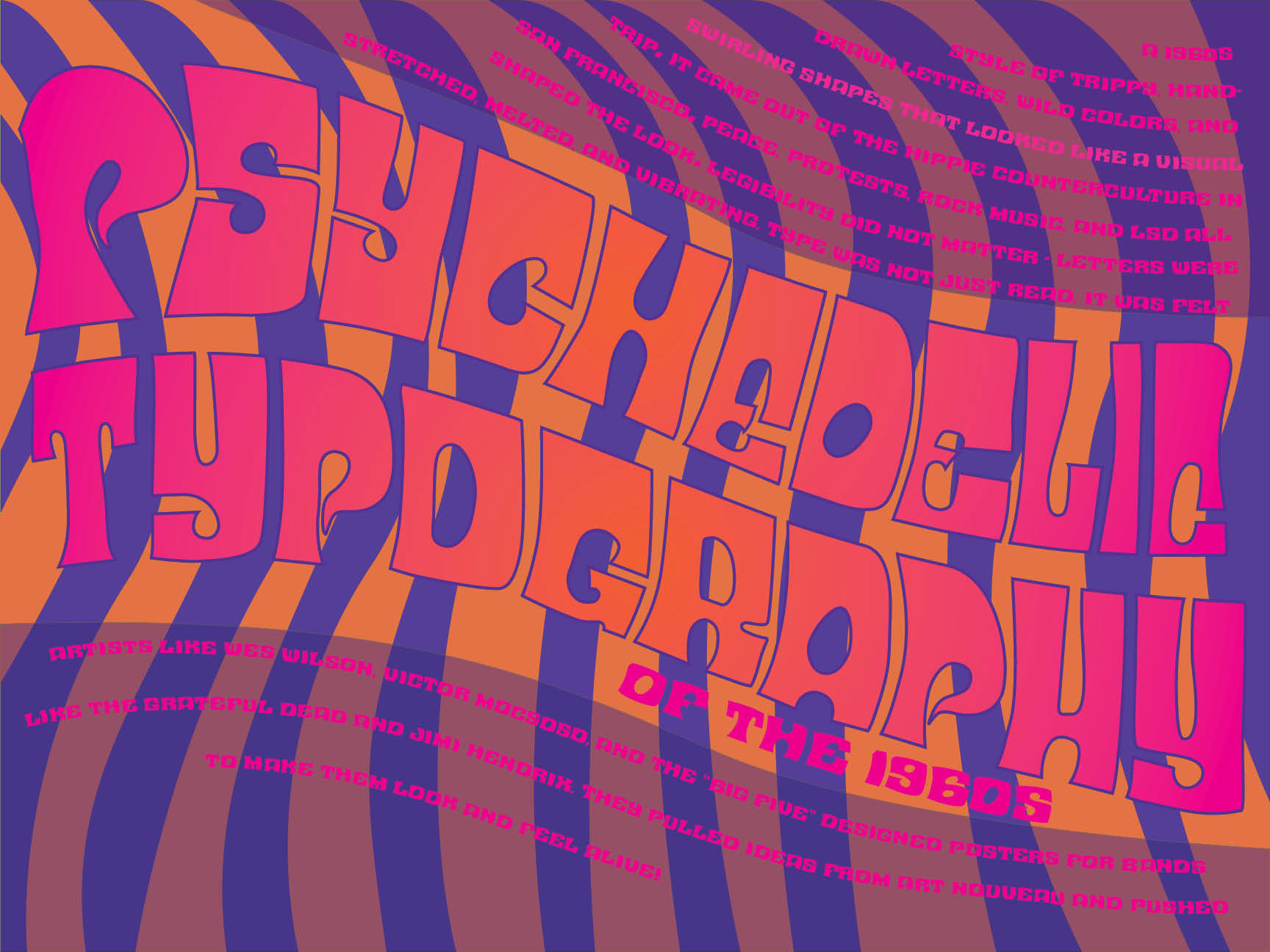
For this project, I designed a typographic history poster focused on psychedelic typography of the 1960s. The goal was to create a design that is both visually engaging and informative, clearly communicating historical context while reflecting the style of the subject matter.
I drew inspiration from the bold, experimental qualities of psychedelic type, including distorted letterforms, vibrant color combinations, and flowing, organic shapes. The layout emphasizes movement and visual impact, while still maintaining a clear hierarchy to guide the viewer through the information. Balancing readability with such an expressive style was a key challenge, as I wanted the poster to feel authentic to the era without losing clarity.
This project helped me explore how typography can function as both a visual and informational tool, and strengthened my ability to design expressive compositions that still communicate effectively.