
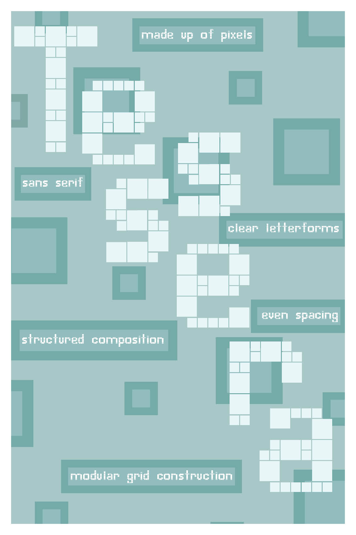
For this project, I designed an original typeface titled Tessera using Glyphs Mini, a program I was learning for the first time. The concept was inspired by Professor Joshua Foust and his work in video games and strategic communication, which led me to explore a digital, pixel-based visual language. The name Tessera, meaning a single tile in a mosaic, reflects the way each glyph is constructed from small, modular units.
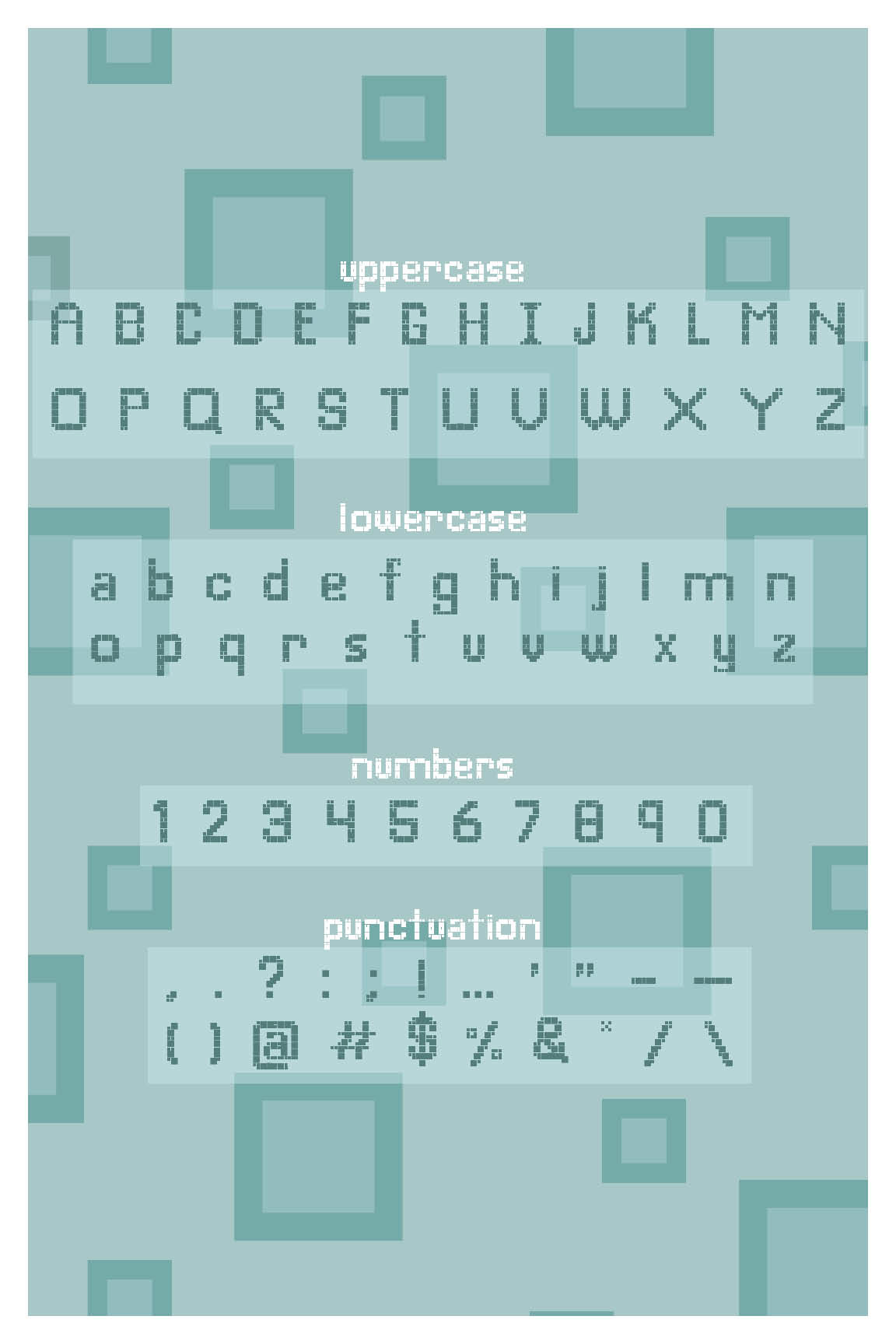
I developed each letterform using a grid-based system, making the typeface appear as if it is built from individual pixels. The process was highly detailed and time-intensive, requiring consistency across the full alphabet, numbers, and punctuation while still maintaining clarity and readability. This challenged me to think carefully about structure, spacing, and how small components work together to form a cohesive type system.
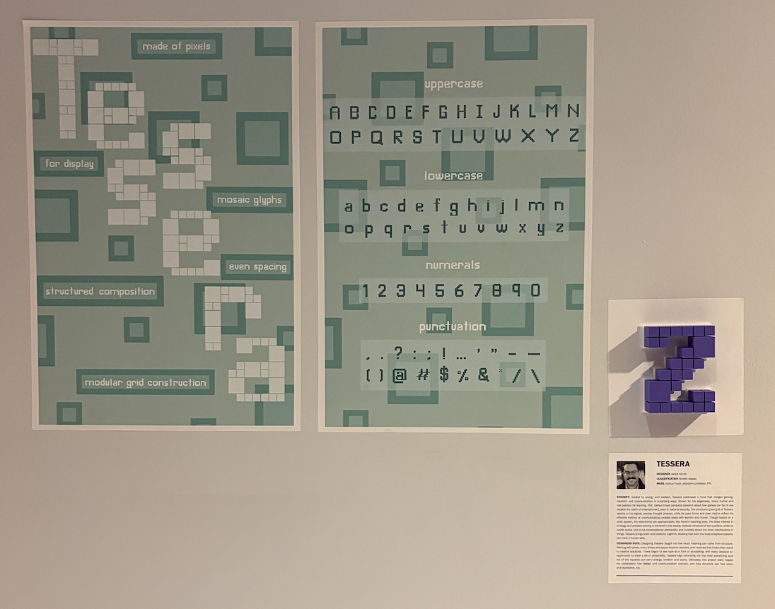
The final project was presented in a two-panel layout showcasing the typeface’s features and full character set, along with a 3D-printed glyph displayed at our class exhibition. This added a physical dimension to the project and allowed me to explore how type can exist beyond the screen.
This project strengthened my understanding of type design from the ground up and challenged me to balance concept, precision, and creativity.