
MEET PiP
WHAT IS PiP?
Pip is a game night subscription box designed to bring people together through playful, low-pressure experiences. The brand is built around the idea that game night should feel easy, nostalgic, and fun from the moment the box arrives.
For this project, I developed a full visual identity system, including the logo, color palette, typography, packaging, stationery, social media mockups, and brand applications. The goal was to create a brand that feels approachable and energetic while still being polished and cohesive across every touchpoint.
BRAND CONCEPT
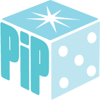
The name Pip comes from the dots on dice, which became the central idea behind the brand. I used this concept to build a visual system that feels playful, recognizable, and easy to apply across different formats. The goal was to create something simple but memorable that could expand across packaging, print, and digital design.
The brand voice is lighthearted and nostalgic, inspired by the feeling of a casual game night with friends. I wanted the identity to feel fun and inviting without becoming overly childish, balancing playful elements with clean and structured layouts.
VISUAL IDENTITY
The visual identity for Pip is built around bold color, rounded forms, and simple graphic elements. The dice motif acts as both a logo and a repeating design element, helping create consistency across all brand touchpoints.
I used a bright but controlled color palette to keep the brand energetic while still feeling cohesive. Typography was chosen to support readability while reinforcing the brand’s playful tone.
Throughout the system, I focused on creating consistency so that every piece feels connected, from the box design to smaller applications like stationery and social media.

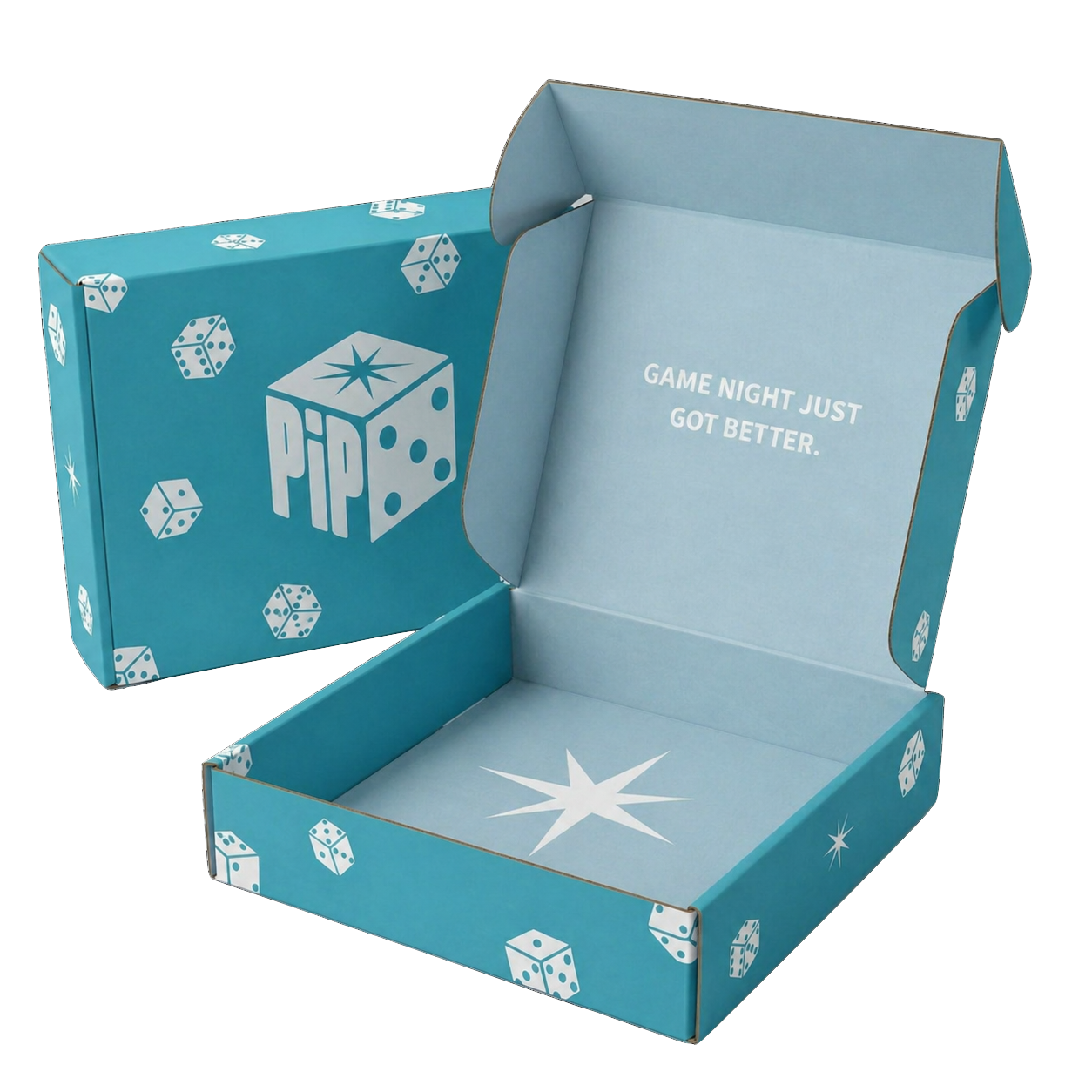
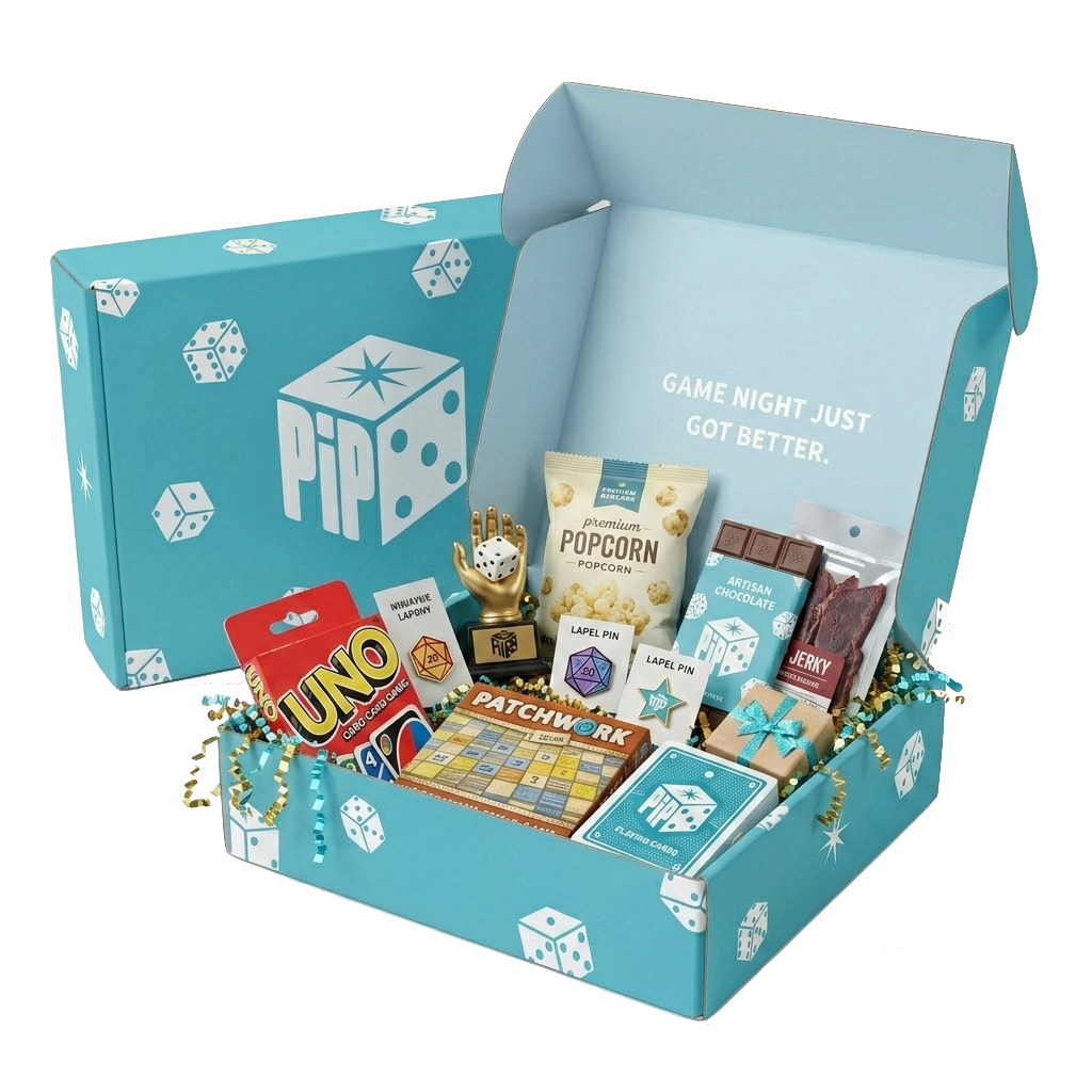
PACKAGING
Packaging was a major part of this project because the unboxing experience is central to the subscription box concept. I designed the box to feel exciting and inviting, using the brand colors and logo placement to create a strong first impression.
The exterior introduces the brand clearly, while the interior adds an extra moment of surprise. I wanted the box to feel like more than just packaging, it should feel like the beginning of game night.
APPLICATIONS
To show how the Pip brand can extend beyond packaging, I applied the identity across a range of real-world touch points. These applications helped test the flexibility of the system while maintaining a consistent and recognizable look.
MERCHANDISE
The Pip brand was also applied to merchandise to further extend the identity playfully and tangibly. These pieces highlight how the visual system can translate across different materials while maintaining consistency and personality.
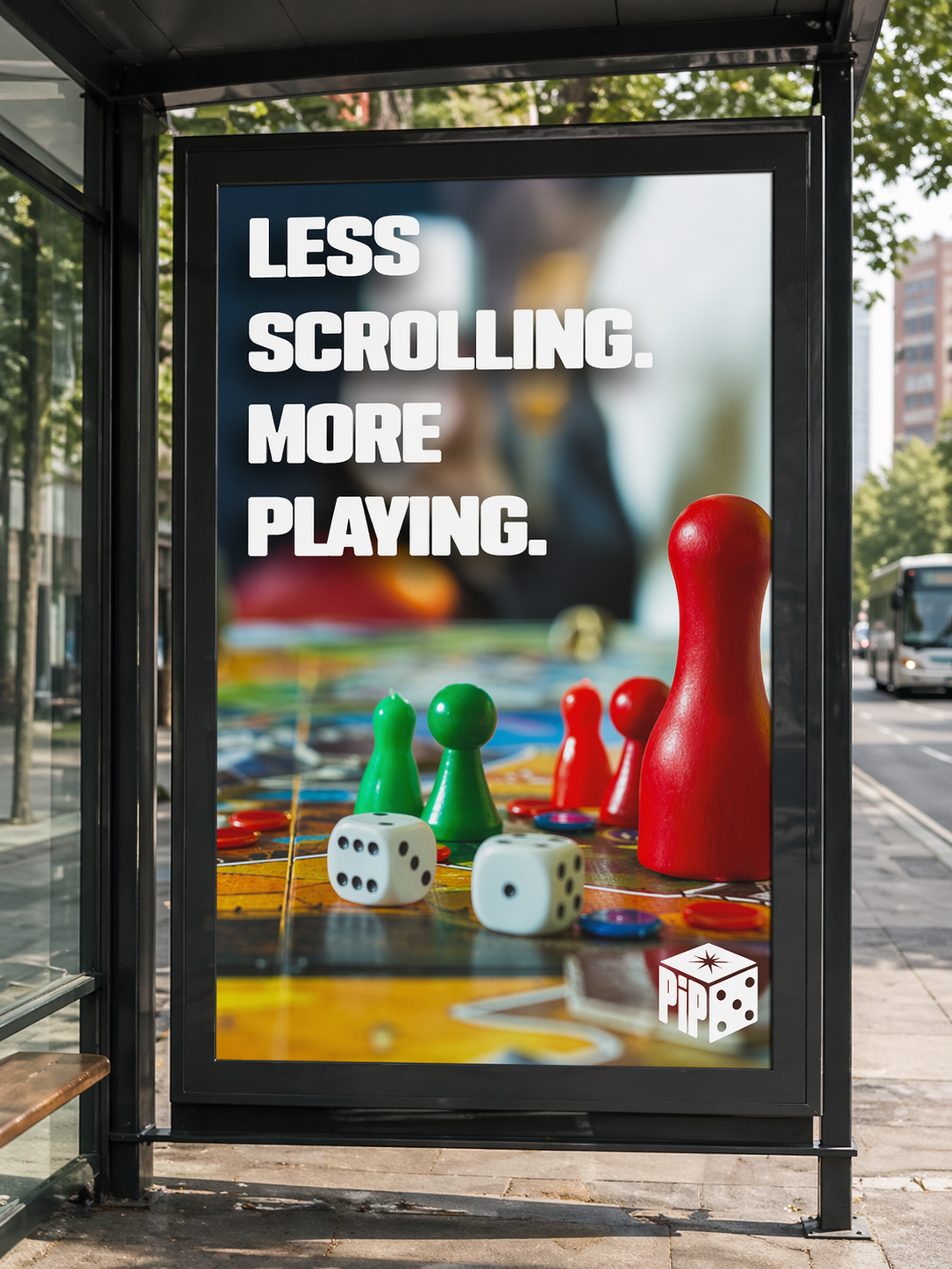
PiP Bus Stop Poster Advertisement
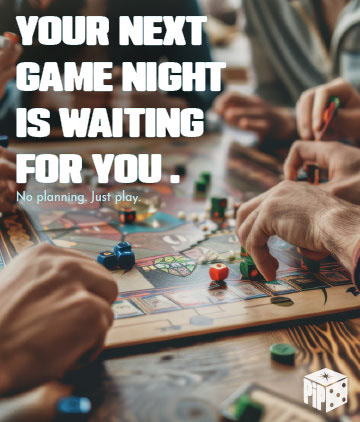
PiP Instagram Post
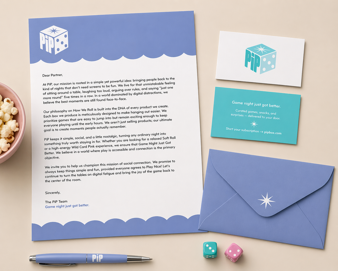
PiP Stationary Set
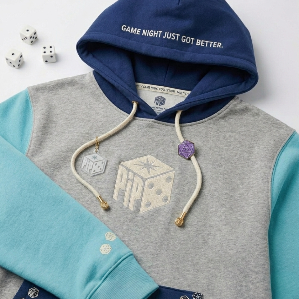
PiP Hoodie
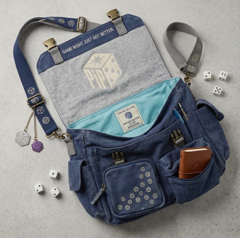
PiP Messenger Bag
SUBSCRIPTION EXPERIENCE
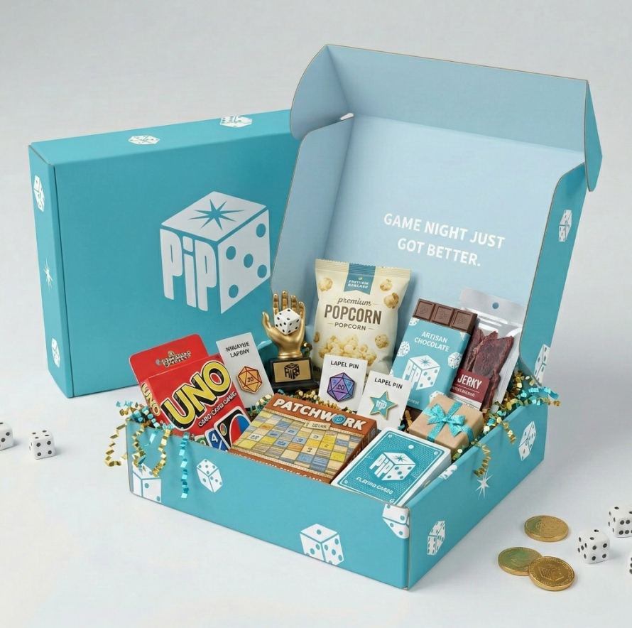
The PiP Game Night Box
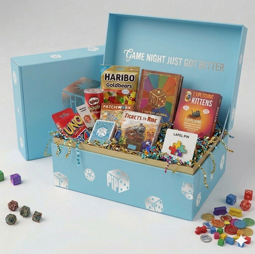
The PiP Silver Box
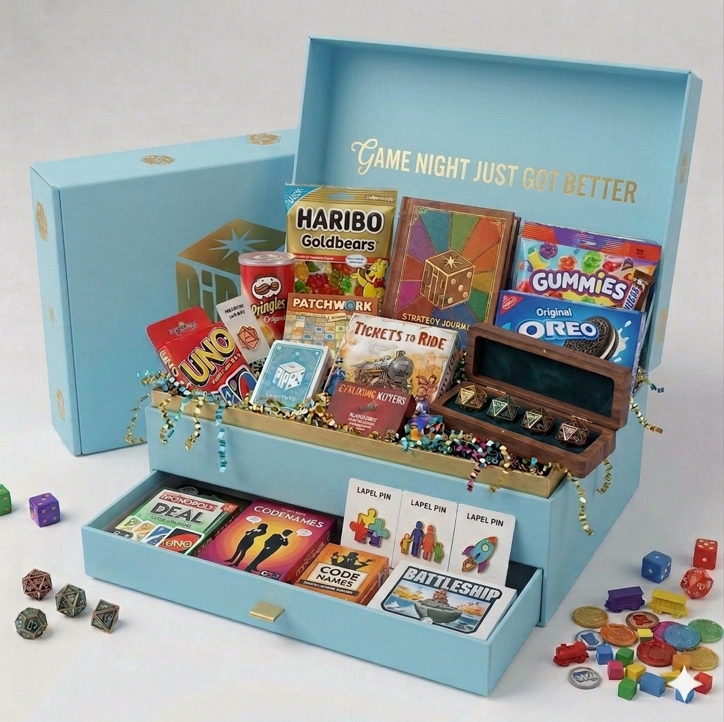
The PiP Gold Box
Each pip box is curated to create a fun and low-pressure game night experience. From games to snacks and small extras, each tier offers a slightly different experience while maintaining a consistent and playful brand feel.
REFLECTION
This project helped me better understand how to build a brand system from the ground up. I learned how important it is for every design decision, from the logo to the packaging to the smallest graphic details, to connect back to the overall concept.
Pip challenged me to balance playfulness with structure and create a brand that feels both fun and functional. It is one of my most complete projects because it shows concept development, visual identity, packaging, and real-world brand applications working together.